
How are colours trendy?
Nov 16, 2023Learning from the masters of colour
Extract from the interview with Leatrice Eiseman form EDGE 2 fanzine
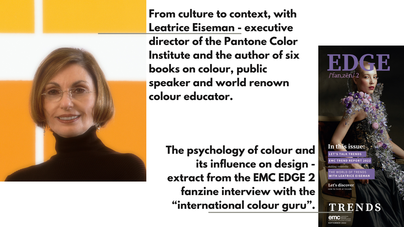
Leatrice Eiseman is an American colour specialist, who assists companies in their colour choice in a range of areas, including packaging, logos, and interior design. She is the executive director of the Pantone Color Institute, a division of Pantone, Inc., and the author of six books on colour, one of which won an award from the Independent Publisher's Association.
From the perspective of florists and floral designers, colour and trends have a huge influence on us, therefore a conversation with Leatrice Eiseman regarding these subjects gives an interesting and valuable insight into how we should use and approach our design work.
When EMC created the Trend Report 2022 we published a special edition of the EDGE fanzine which featured an extensive interview with Leatrice Eiseman, the international colour guru, as she is referred to. A renowned colour consultant, she is a leading authority in guiding various industries on their colour choices, from brand identification to new product development. Her extensive work includes a collection of books, each tailored to specific industries, such as graphic design, interior design, and personal use, with a focus on the significance of colour. As a presenter, she delves into the psychology, emotional connection, and colour trends, acknowledging the intricate nature of colour with its myriad values, shades, nuances, and contextual variations. Leatrice emphasizes the flexibility and creativity that colour can bring, preferring the term 'guidelines' over rigid rules to encourage creative expression.
The interview focused on elaborating a conversation around colour and its importance in floral design.
As part of her teaching portfolio, Leatrice Eiesman explores the intersection of colour with the natural world, addressing the inquiries often raised about the role of colour in nature. This exploration leads to a profound understanding of how natural colours influence and expand our colour palettes, particularly within the context of the wedding industry. She seamlessly integrates her colour system into wedding colour selections, recognizing the harmonious interplay between wedding colours and the floral elements that thrive in the natural world.
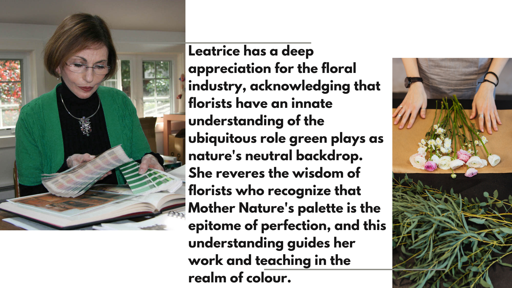
Leatrice possesses a deep appreciation for the floral industry, acknowledging that florists have an innate understanding of the ubiquitous role green plays as nature's neutral backdrop. She reveres the wisdom of florists who recognize that Mother Nature's palette is the epitome of perfection, and this understanding guides her work and teaching in the realm of colour.
Leatrice Eisman's journey with "Colour of the Year" since its inception in 1999 has been a remarkable endeavour. When they started ‘Colour of the Year’, people were starting to ask Pantone about it. As a consultant for Pantone and Executive Director of Pantone itself, their mission was to get people talking about colour and starting a conversation. It was picked up by the media, making the conversation grow. More and more people were going on to the website to find out what the colour of the year was going to be. They were getting people to talk and, when you get people to talk colour, you can listen to them and review things, based on finding out what they like, what they don’t like and what colours mean to them. We need to keep people talking about colour, because we understand that there is a far deeper fascination for colour than we possibly ever realised. People look out for the colour every year and it has become a trend in what we do in the modern world. Trends show the colour palette and this is what you need to use for whatever you are designing. Trends are bringing a newness and freshness, allowing you to exercise more creativity.
Something we are doing tells people that there is a newness and freshness out there and our challenge is to take it on creatively. It is not necessary to tell your client that this colour is what they must have, but just to show how you value the opportunities to be more creative. Leatrice works on several colour trends for Pantone. She does one for interior design where they often use pictures of floral designs. She knows whenever she uses floral images, companies love it, so that is always something included in their Trend Forecasts. She does that for Pantone once a year for interior design and then, twice a year they look at the colours coming down the runway for the future and create a similar forecast for the following season and that is available on the Pantone website.
It is about looking for clues out in the real world that tell them the zeitgeist, going on in the world around us and how people want to live. You cannot give just one choice of colour palette. People have different lifestyles, some are better than others and you need to surround yourself with colours that really speak to you so Pantone do anything from seven to nine different palettes that reflect different lifestyles, and different preferences to give everyone choices. This may be even in soft pastels or neutrals, giving them something fresh and new for the eye to see. You might have a neutral palette, but what can you do with that neutral palette that isn’t going to cost a lot of money, and yet introduces a new thought or idea and that is all that trends are about.

The year that they chose Marsala was a challenge. Based on the research that Leatrice and her company had done, they went with Marsala, the wine, and they knew the imagery would be beautiful. In the floral industry, they knew that there would be beautiful marsala colours and even deeper tones, as they were already around. In the movie industry, they also saw it and the indicators were already there. They merely chose the colour that was related to the biggest implied impact and indicators. In the beauty industry, the marsala colour appeared in lipsticks and nail polishes. In the digital world, it was used with animation and gaming giving very dramatic usage of colour.
There are always general precepts offered through different media, such as trade shows, which could be fashion, interior designs, or even graphics. If you are a floral designer, then it will be a floral trade show. Even a floral designer can learn where the general directions are going and what fashion is saying. If you look at big sports events such as the Olympics or Soccer finals, a lot of people are going to be watching them. What is there about the host country? What are the colours of the flags? What are the uniforms going to be, because this is the host country? What movies are at the production stage? Will they have a colour around them, especially animated films, because animators and graphic designers are great in using colour. You start to see a pattern, the wheels begin to turn, and you start to see how to use these colours. Then it becomes a context. What does that colour represent in today’s society and why are people talking about it.
That becomes the clinical part and that is where colour psychology comes into play. You have to look at fashion, beauty and all of the other industries, evaluate them and build up a reservoir of what colours you think are the most important ones, and what they represent.

With the emotional aspect of colour, she has done Colour Word Association studies for a number of years, and they have seen changes in how people respond to a time in history and what else is happening around them. They know that if things have happened to you in the past, in your childhood, they affect you. Something that has affected you badly as a child is implanted in your mind and any colour associated with it means that you do not like that colour anymore, although you may not remember why. It is stored in your memory bank. If you really think about it, the answer may eventually come to you as to why you don’t like that particular colour. Doing colour association work around the world, they found the same sort of reactions, so it is universal. Blue is such a popular colour all around the world because people associate it with a clear blue sky. When you were very small, your mother would have looked out of the window and said ‘just look at that beautiful, blue sky. You can go outside and play.’ All pleasant associations. However, if she looks out of the window, and sees that it is grey and rainy, she will say’ Oh dear, it is all wet and miserable, it is a horrible grey day’, so you now associate with grey being cold and miserable. However, grey can be a fabulous colour, especially when you spark it with other colours. So, again, context is very important.
When florists work with their customers, they must find out what they want. Who are they trying to please? Who is the customer? Who is going to buy what it is you have to sell? The florist needs to divorce their personal self from their professional self. What seems very obvious to us may mean that their views may affect the success of what they want to sell to their clients. Women, more than men know the beauty colours, they know the fashion colours, they read about the trends. You have to show yourself as somebody who has really tapped into that and understand what your client’s needs are, because you need to earn the money that comes from the business and if you are not selling, you are not earning.

Your clients know even less than you do. You know far more about colour than they do, because you are in that field and they are coming to you for advice. Sometimes, the client is using you because of your style, and colour has little to do with it; but today, your clients are going to be very smart about things as well, because they have all this access to knowledge. Leatrice understands those people who say ‘I don’t pay attention to trends; I am just choosing what I think works’. She says that she would certainly not want to hamper that and impede the abilities of their own creativity and talent. However it is still important to know what is happening out there, so to some extent you can utilise it. If a client is having a wedding but is not completely certain of the main theme, they may not realise that the flowers would need to connect with it. You can say to them that it should be really unique; that they want it to be a happy occasion and you might suggest yellow and to make it a little different, you’re going to add grey, which is a very unique combination. The men could all wear grey tuxedos, and some of the ladies could wear a touch of yellow. Then, you may have something to draw on that could utilise the trend. If your client prefers to not have that tone of grey, maybe you could go to a deeper one, maybe turning it into a gunmetal grey. Having some knowledge of trends, you can suggest different combinations of colours, and be able to suggest something personal.
Even though you may not be suggesting a trend colour, or the colour of the year, you are showing that you are staying on top of directions. Florists should be showing that they are not stuck doing the same old things. A lot of florists are trained to use the colour wheel, which is wonderful, because it is a great training tool. In practise, maybe we take pink and change it to fuchsia or hot pink, and then we could take the green and turn it into absinth green, making something very sharp and pungent. Even though these are not trend colours, you are showing that you are thinking outside the box. That is what trends are all about.
from EMC EDGE 2 Fanzine
edited by Sara Marie Andrews, EMC
Don't miss a beat!
New blogs, course offerings and what we are up to delivered to your inbox!
We hate SPAM. We will never sell your information, for any reason.
